Friday, 6 December 2013
What is a Digipak?
A digipak is type of packaging that is used for CD's and DVD's. It can come in a range of different materials such as cardboard, plastic or even glass. Artists tend to use these for their album covers, they often design it in a particular way to represent the artist. This can consistent upon three main things: Colour, an artist may choose to incorporate a particular colour scheme that is used a number of times by them in other media platforms such as music videos to show a clear link between the two. Font, the font of the digipak may be seen as a representation of the artist as well. An artist that has songs with deep sentiment may choose to use an Italic font to represent delicacy whereas an artist belonging to a metal genre may choose a stronger font. Imagery, a digipak may contain images that will make the audience recognised who the product is by. Artists such as Daft Punk uses the two spaceship helmets on their digipak which allows their audience to recognise them instantly. For this course, we will be designing a digipak for our main artist Deseree Diamond. We will need to follow the conventions of designing a digipak, taking into account about the Do's and Dont's and doing plenty of research to see what will be suitable for our artist.

Thursday, 5 December 2013
Ancillary Products - Design Production work
THE DO'S AND THE DONT'S!!!


1. Clear Fonts: Use fonts that everyone can read, fonts that are suitable for your chosen genre, fonts that go well together. Not fonts that make it look pretty but impossible to read.
2. Suitable Colours 3 COLOURS MAXIMUM, Colours that also go very well together. Do NOT go crazy on the colours, Making people feel as if they've jumped into a packet of skittles, HOW DARE YOU!!
3.Clear Photos Using photos that are clear and in focus is just basic Common Sense GUYS. Make the photos the appropriate size for your digipak. Do not use a photo that is hard to look at.
4. Rule of thirds Follow the rule of thirds. ITS THAT SIMPLE.
REMEMBER REMEMBER REMEMBER
Include the bar-code, date, copyright information, title of the album (Obviously), artist name (Duhh), Record company logo, website and the artist website.
5. DO NOT use unnecessary effects, use effects according to your genre. Keep it simple but UNIQUE.
6. Dont Stretch your image, DO NOT make your artist un-proportionate, THEY WILL NOT LIKE IT. If the image isn't the right size find one that is the right size.
7. DO NOT put text across the artists face, As an upcoming artist people would want to see what YOU look like and not how fancy the text looks.
8. And finally DO NOT use photos on every single panel. Not all digipaks have photos on all of the panels, Personally I think it looks tacky. Follow the CODES&CONVENTIONS correctly when looking at the genre linked to your artist and use the ideas in your digipak.
!!!!DO YOUR RESEARCH CAREFULLY!!!!
Creating a digipak
After finishing editing the music video, we now need to creating a digipak which is like an album cover for our main artist. In this lesson, we were asked to use Adobe photoshop to practicing creating digipak with allocated images. Here are some screenshots of my work during this lesson:


This is the layout of the digipak. On the right hand side is the front cover of the digipak, in the middle is the spine and on the left is back of the digipak.

This software is great to create the digipak because it is specialised in manipulating images.

This is the track list of the digipak

This is the image that I chose for my front digipak.


Here are the tools that I will be using as the essential for creating the digipak
Ancillary Practice

Ancillary practice didn't go as well as I hoped. The idea that I was aiming for proved to be harder to execute. I was planning to add an old school film frame to link with the old school picture, but i struggled to find a suitable frame and instead had to settle for the wrong one. I spent too much time on trying to find a frame and didn't get to the back of the digipak.
Wednesday, 4 December 2013
Monday, 2 December 2013
Analysis of digipak and advertisements
The artist that we chose to do was AlunaGeorge and the genre of her music is electronic, pop and garage, three other artists that share the same genre with AlunaGeorge are Katy B, Disclosure and Chase&Status.
Katy B
 This photograph was from Katy B's digipak for her song 'Katy On a Mission'. The codes and conventions that come with an artist that fall into the category of pop, garage or electronic music all evolve around colours and disorientated photos of either the artist or something completely random. My opinion of this is backed up by this digipak. The colouring of this digipak makes everything dreamlike and surreal something that would link to artists around the same genre including their music videos. I also think that this photograph is self explanatory, it speaks out for itself, it doesn't need big,stylistic fonts all over the cover to make it stand out, Katy B's posture already stands out for itself with the help of the colour in the background, giving the poster a sense or originality, not following into the footsteps of other artists that use stylistic writing all over the cover and "over-the-top' photographs to grab the attention of future possible fans.
http://www.youtube.com/watch?v=qNhPYj-5rIY Here is the video to Katy B - Katy On a Mission.
In this video are obvious codes and conventions that link towards the genre of pop, garage and electronic music, and they are, close ups of artist, live audiences, flashing lights, possibly a DJ Deck and the person that produced the beat to the song.
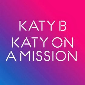
This is the advertisement for Katy B's single 'Katy On a Mission'. Many electropop/ garage artists, when advertising, only advertise the artists name and the song, I have seen this on many artists that fit in the category of garage, pop and electro. i think they do this to emphasis only on the song rather than other things that could drift their mind away from the actual single that has been released. Just like the digipak this poster has similar colours however the colours are more obvious to make the writing stand out, on the digipak the colours were faint so that the audience/fans would be able to see Katy B seeing as she is the artist.
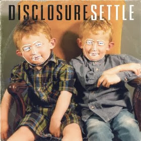
This photograph is of an electro/pop group named disclosure and just like Katy B's digipak the front cover is very simple, things like the outlined scribble faces on the two little boys are what makes the poster as eye catching as it is. Looking at this poster no other poster comes to mind which is a good thing because it means that no other artist has ever done this type of thing before making their poster unique and automatically making them stand out above the rest. The codes and conventions of electropop/garage artists all fall into this photograph, the artists always want to keep their albums, digipaks and poster simple however have something small that will make the poster or album unique, something that portrays the artist.

Here is the poster to Disclosure, once again very simplistic, not over the top but still draws attention to itself. This poster links to the digipak, just like the digipak this poster has the same outlined scribbled faces on them which could suggest that they use this as branding technique, every time someone sees this they would automatically think of disclosure because this is something they have decided to be recognised by.
http://www.youtube.com/watch?v=bkk2H3Ztrfk

Both of the artists all have the same thing in common and so does this artist, 'Keeping it Simple', onceagain this electropop group have kept it simple when releasing the didgipak, on the front cover it only has the artists name and the name of the song which obviously is common which has been shown on two of the other artists digipaks. Chase&Status are both men and this cover links bak to them, being boys they would like cars and racing, once again linking back to personal hobbies or interests, something that identifies them.

And also just like the other advertisements it only shows the artist and the song name, both the digipak and the advertisement have the same type of font at the front something that links the two together.
By looking at all three of these digipaks and posters I have seen that artists that belong to the same genre (Electropop, Garage and pop) all have the same thing in common which is making there posters and cover albums simple. the artist that we have chosen belongs to the genre of electropop and garage so when making our own digipak i would have to make sure to also keep it simple but somehow unique.
Katy B

http://www.youtube.com/watch?v=qNhPYj-5rIY Here is the video to Katy B - Katy On a Mission.
In this video are obvious codes and conventions that link towards the genre of pop, garage and electronic music, and they are, close ups of artist, live audiences, flashing lights, possibly a DJ Deck and the person that produced the beat to the song.

This is the advertisement for Katy B's single 'Katy On a Mission'. Many electropop/ garage artists, when advertising, only advertise the artists name and the song, I have seen this on many artists that fit in the category of garage, pop and electro. i think they do this to emphasis only on the song rather than other things that could drift their mind away from the actual single that has been released. Just like the digipak this poster has similar colours however the colours are more obvious to make the writing stand out, on the digipak the colours were faint so that the audience/fans would be able to see Katy B seeing as she is the artist.

This photograph is of an electro/pop group named disclosure and just like Katy B's digipak the front cover is very simple, things like the outlined scribble faces on the two little boys are what makes the poster as eye catching as it is. Looking at this poster no other poster comes to mind which is a good thing because it means that no other artist has ever done this type of thing before making their poster unique and automatically making them stand out above the rest. The codes and conventions of electropop/garage artists all fall into this photograph, the artists always want to keep their albums, digipaks and poster simple however have something small that will make the poster or album unique, something that portrays the artist.

Here is the poster to Disclosure, once again very simplistic, not over the top but still draws attention to itself. This poster links to the digipak, just like the digipak this poster has the same outlined scribbled faces on them which could suggest that they use this as branding technique, every time someone sees this they would automatically think of disclosure because this is something they have decided to be recognised by.
http://www.youtube.com/watch?v=bkk2H3Ztrfk

Both of the artists all have the same thing in common and so does this artist, 'Keeping it Simple', onceagain this electropop group have kept it simple when releasing the didgipak, on the front cover it only has the artists name and the name of the song which obviously is common which has been shown on two of the other artists digipaks. Chase&Status are both men and this cover links bak to them, being boys they would like cars and racing, once again linking back to personal hobbies or interests, something that identifies them.

And also just like the other advertisements it only shows the artist and the song name, both the digipak and the advertisement have the same type of font at the front something that links the two together.
By looking at all three of these digipaks and posters I have seen that artists that belong to the same genre (Electropop, Garage and pop) all have the same thing in common which is making there posters and cover albums simple. the artist that we have chosen belongs to the genre of electropop and garage so when making our own digipak i would have to make sure to also keep it simple but somehow unique.
Subscribe to:
Posts (Atom)