Showing posts with label Benjamin. Show all posts
Showing posts with label Benjamin. Show all posts
Friday, 24 January 2014

Evaluation: Question 2
How effective is the combination of your main product (video) and ancillary texts (digipak and advertisement)?
Question 4: Additional feedback
This feedback for my music video gave me the sight of what I could have done to improve some of the things in the production. One of the comments mentioned that we needed more location choices as it would be more appealing to the audience. To a degree, I agree with this statement. I do believe that we, as a group, could have been more imaginative with some of the location choices and really capture a stronger narrative within the production. However I do believe that some of the location choices was a clear representation of the artist as it stated luxury and good standard of living, which is what our artist is all about.
Thursday, 23 January 2014
Monday, 20 January 2014
Evaluation: Question 1 (Part One: Music Video)
In what ways do your media products use, develop or challenge forms and conventions of real media products?
The project for this year was based on creating and developing an artist of our choosing through the use of media products such as Digipaks, advertisements and the recording of a music video. We had to design these products in order to give a strong title to our artist and promote them as much as we could. The first product we had to produce was the music video. Before the process of editing and going out to get footages, we had to research the type of genre we were willing to imitate and the conventions of a music video. Many theorists have different ideas for the conventions to a music video. For instance, Andrew Goodwin argues that every music video has three type of distinctions between them: Illustration, Amplification and Disjuncture. In brief, illustration is self explanatory- this is when the artist displays images and footages that are correspondent to the lyrics. Amplification is when the video has different type of meaning to the lyrics and disjuncture is when the footages has no relation to the lyrics. Another theorist, Carol Vernallis, states that music videos tend to break the rules of continuing editing in order to keep the viewer at interest. This is done by music videos having more jump cuts. Lastly, the last theorist, Laura Mulvey, talks about the male gaze. She believes that all music videos have a clear representation and she states that some consistent on the male gaze. This is when the women in the music video are objectified and intentionally to be portrayed as sex objects.
As we covered the conventions of a music video, in the design of the music video we decided to follow the aspects of amplification and illustration- by displaying images that suggests the lyrics of the song (Attracting flies). Our music video belonged to the Genre of Electro pop and we decided not to follow the conventions of this genre as we wanted focus all our attention with having a clear narrative to the song. For our music video, we had a few music videos that may have had a strong influence to the final design of the video. Here are some of them.
The first video I would like mention that had a strong influence to our music video was Azealia Banks 212:


The project for this year was based on creating and developing an artist of our choosing through the use of media products such as Digipaks, advertisements and the recording of a music video. We had to design these products in order to give a strong title to our artist and promote them as much as we could. The first product we had to produce was the music video. Before the process of editing and going out to get footages, we had to research the type of genre we were willing to imitate and the conventions of a music video. Many theorists have different ideas for the conventions to a music video. For instance, Andrew Goodwin argues that every music video has three type of distinctions between them: Illustration, Amplification and Disjuncture. In brief, illustration is self explanatory- this is when the artist displays images and footages that are correspondent to the lyrics. Amplification is when the video has different type of meaning to the lyrics and disjuncture is when the footages has no relation to the lyrics. Another theorist, Carol Vernallis, states that music videos tend to break the rules of continuing editing in order to keep the viewer at interest. This is done by music videos having more jump cuts. Lastly, the last theorist, Laura Mulvey, talks about the male gaze. She believes that all music videos have a clear representation and she states that some consistent on the male gaze. This is when the women in the music video are objectified and intentionally to be portrayed as sex objects.
As we covered the conventions of a music video, in the design of the music video we decided to follow the aspects of amplification and illustration- by displaying images that suggests the lyrics of the song (Attracting flies). Our music video belonged to the Genre of Electro pop and we decided not to follow the conventions of this genre as we wanted focus all our attention with having a clear narrative to the song. For our music video, we had a few music videos that may have had a strong influence to the final design of the video. Here are some of them.
The first video I would like mention that had a strong influence to our music video was Azealia Banks 212:
These two particular shots were a strong influence in our music video because we had a similar camera shot when we were filming. The close up of the artist's lips and the mid shot of the artist behind a wall, these were used because we liked the idea from Azealia Banks' video. We interpreted that the two shots displayed above showed that the artist is confident and not afraid to get up and close with the camera and the same time it somehow gave her feisty image. We wanted to give this image to our artist- the girl with attitude and glamour. Also there was a strong link to the mise en scene between our artist and Azealia Banks. In both of the footages with the artist standing against the wall, we see that their costumes are almost the same. The white jumpers with the black writing shows a strong influence. Again this was to display our artist with some attitude by the informal type of clothing we chose for her. As I felt that Azealia Banks was represented as a sex object, we decided to challenge the theory of women being displayed as sex objects according to Laura Mulvey. From this, we wanted our artist to be seen as a strong and independent artist that inspires young women.
Another video that had a strong influence was American Boy by Estelle. As this was the original song that we wanted to do, you will find that most of our products and image is strongly influenced by Estelle.
Since our song is about a bad lovestory between the girlfriend and boyfriend, we decided to use the same mid shot that was used in American Boy. We also used this shot because it displayed glamour between the two characters but we wanted something a little different and wanted to slightly challenge this in our music video. Instead of being a romantic atmosphere with both characters being glamorous, we only wanted the artist to seem glamorous by carefully picking out the costumes for the two characters. Boyfriend, dressed in dirty fashion, and the girlfriend, in classy and expensive clothing. This was to display illustration within the lyrics and also follow the image we wanted for our artist which involved a luxury lifestyle; an image that was heavily influenced by American Boy. In the other screenshot above, the outfits for Deseree Diamond (our artist) and Estelle have some similarities. Another influential aspect is the mise en scene, the rich and classy costume between the two artist are very similar. The hairstyles are almost in common as we believed that Estelle beautifully portrayed the idea of luxury with the costumes and hairstyle. With the theory of Andrew Goodwin, we decided to follow the conventions of illustration as we wanted to create a narrative in the video.
Another video that also had an influence to the production of our music video was Brandy Ft Monica- The boy is mine. Here is a clip to the video:
From watching this music video, it is clear that we have challenged the aspects to it. The reason why is because we wanted one artist and wanted to create a narrative to the music video. But with the idea of the two contrasting characters, we decided to slightly incorporate that into our main artist, Deseree Diamond.
Between the costumes, we can see a clear contrast. This was to create the idea that character, Deseree Diamond, was miserable without the boyfriend and towards demonstrate that she found independence. The idea from the video 'the boy is mine' helped to create a strong structure to the story of the video. This also helped develop the image of the artist being glamorous and feisty.
Thursday, 16 January 2014
Monday, 13 January 2014
Analysis of Advertisement
Before designing the advertisement for the album 'Freedom' for our artist, Deseree Diamond, I had to do some research about the conventions of advertisements. Since our genre is electro pop, I wanted to have a similar features to the genre and at the same time having a simple and strong structure to it. During my research of my advertisements, I stumbled across a few that caught my interest.

 Similarly with this advertisement of Beyonce, the image of the artist is strong and the name is in a bold font. Other than that, there is hardly information of the product.
However in my design, I would include reviews of magazines, star ratings and social networking sites that will help for distribution.

As you can see the name of the artist is in an huge font so it could grab the attention of the people that happen to this product. The images are bold are strong and appealing to the audience is states independence of the artist which is a key aspect I am looking for my own design.

However in my design, I would include reviews of magazines, star ratings and social networking sites that will help for distribution.


Thursday, 9 January 2014
Draft Advertisement

As you can see from the image above, my draft advertisement contains the vital elements for advertising an album. I have the name of the artist to show the audience what her name is, an image of the artist that takes up the right side of the design and the name of the album in an huge font. The other elements such as the reviews, record label, distribution and rating are used to convince the audience to buy the album. As this is just the draft design, I would improve some aspects of this version by getting reviews from other people.
Monday, 23 December 2013
Reflecting on AS' Digipak
Back in AS, my group and I had to designed an individual album cover (digipak) for our artists Rizzle Kick. As this was my first time using Adobe Photoshop, I was unfamiliar with some of the tools of the programme. Here is the digipak that I designed during the summer last year:


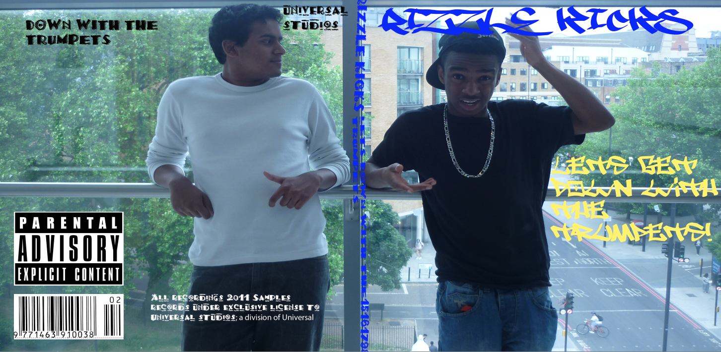
Rahi and I were the two main artists for our single, 'Down with the trumpet'. I had an idea to have me on the front cover and Rahi on the back to illustrate a binary type of bond between the two. The content of a digipak is shown above- it contains an image of the artists, the name of the artists and the name of the album. However the font used in this design is unreadable and the colour scheme is not matching therefore breaking the conventions of designing a digipak. The information within the spine of the digipak is accurate but again the font is not matching to the image and there is no clear distinction between the spine and the front cover. Although it is fitting to our genre,Hip hop/R'n'B, the quality seemed to be lost whilst I was resizing the text. On the back cover, I added the barcode of the CD, the record label and the CD writing and the bottom right. I did not, however, add the track list of the album which is essential for designing a digipak.
Looking back at this design, I have improved my skills with using Photoshop. I learnt how to resize images without losing the quality and I also learnt how to add filters to images to give a deeper effect. I have a better understanding of what the essentials are for designing a digipak such as adding the track list and having a matching colour scheme etc. Here is an example of my latest design of my digipak for our artist , Deseree Diamond.

Thursday, 19 December 2013
Final Design for digipak (Exterior)

This is the final design for my digipak, I will create the interior when we return in the new year. As I was given a feedback, I was able to modify my initial design of the digipak. Since the previous design, I was able to add a shading filter to the image of our artist to add an interesting effect to the image. I also changed the font as it was easier to read and decided to follow the colour scheme of Black, Gold and White. On the back cover, I included the cd writing and other logos such as HMV and Virgin to create realism within the design.
Monday, 16 December 2013
Photo of the artist

As everyone within my group are designing their own digipak, we all had to choose different pictures of our artist. I decided to use this particular picture because the framing is really strong and there is a sense of ambiguity on how she feels therefore the audience may generate different ideas about the deeper meaning of the album. I cropped the background slightly because the rest of the image was not needed. Although I only done the mockup, I believe that my final design of the digipak will still contain this image.
Photoshop Mockup

Here is my initial design of the digipak. On the right hand side is the front cover, it has the essential details that is needed for a digipak. One being an image of the main artist, Deseree Diamond, another being the name of the artist (which is not written on the face of the artist) and lastly the name of the album. As you can see in the image above, I have included all of these things. In the middle is the spine, all that needs to be included in this section is the name of the artist and the album. On the left hand side is back cover, I decided to use an image of a diamond key to demonstrate a clear representation of the artist because it is one of the aspects she is famous for. Also the key has a strong bond with the title of the album 'Freedom'. It illustrates the physical and mental prison she is escaping from. The black background may suggest that she is currently depressed by something .The track list are on the far left hand side and beneath is the barcode and the record label. Now as this is not the final version of the digipak, there are things I will need to improve on in order to make this successful. For instance, I would need to include the CD writing at the bottom of the back section of the digipak. Also I would like add filters or effects that would be more intriguing and relating to the artist. and lastly I would like to add more colour on the front section of the digipak.
Overview of the costume for Ancillary products
The ancillary products are simply products such as the digipak and magazines, designs that are used to establish an artist and give them recognition amongst their audience. Our artist, Deseree Diamond, will need to take exquisite photos for the digipak so that we could put it on the front cover and the inside of the package. The costume will play will vital role in designing and shooting the images for the digipak. The costume will illustrate the identity of the artist and show the target audience what they are trying to represent.


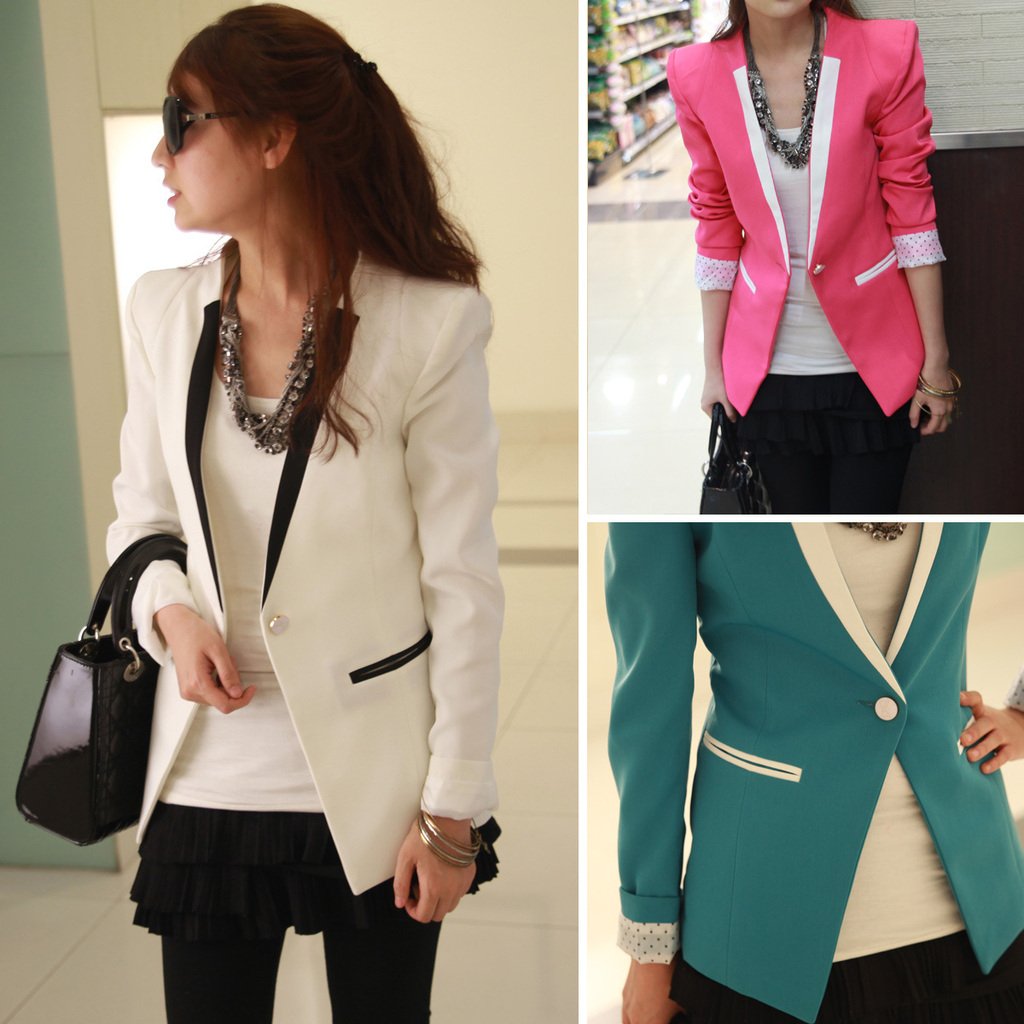
These particular clothing will give the representation we are looking for our artist, which is to display her as a luxurious independent woman with class.
Thursday, 12 December 2013
Subscribe to:
Posts (Atom)